📱 Introduction to UMG
Every game needs a user interface. Health bars tell players how close they are to death. Inventory screens let them manage their items. Menus guide them through options and settings. Unreal Engine's Unreal Motion Graphics (UMG) system provides a powerful, designer-friendly way to create all of these interfaces. In this lesson, you'll learn what UMG is, how it fits into the engine architecture, and how to create your first Widget Blueprint.
🎯 Learning Objectives
By the end of this lesson, you will be able to:
- Explain what UMG is and its role in Unreal Engine
- Understand the Widget Blueprint architecture
- Navigate the UMG Designer interface
- Create and display a basic Widget Blueprint
- Understand the difference between HUD and menu widgets
Estimated Time: 40-50 minutes
Prerequisites: Module 5 (Introduction to Blueprints)
In This Lesson
What is UMG?
Unreal Motion Graphics (UMG) is Unreal Engine's built-in UI framework. It provides tools for creating 2D user interfaces that overlay the game view—everything from simple health bars to complex inventory systems to full main menus.
What UMG Can Create
UMG handles all types of game UI:
HUD Elements (Heads-Up Display): Information displayed during gameplay that doesn't block interaction. Health bars, ammo counters, minimaps, crosshairs, objective markers, and status effects.
Menus: Full-screen or partial interfaces that pause or change game flow. Main menus, pause menus, settings screens, inventory screens, and dialogue systems.
In-World UI: UI elements attached to actors in the 3D world. Name tags above characters, health bars over enemies, interaction prompts near objects.
Notifications: Temporary messages that appear and disappear. Achievement popups, damage numbers, pickup confirmations, and tutorial hints.
Figure: Different types of UI elements, all created using UMG.
UMG vs. Other UI Systems
Before UMG, Unreal used different UI systems. Understanding the history helps clarify what you might encounter:
UMG (Current): Blueprint-friendly, visual designer, powerful and flexible. This is what you should use for all new projects.
Slate (Underlying): C++ UI framework that UMG is built on. Powerful but complex. Used for editor UI and when UMG isn't enough. You won't need Slate for most game UI.
HUD Canvas (Legacy): Old system from UE3 era. Draw commands directly to screen. Still works but UMG is preferred.
How UMG Works
UMG uses a hierarchy of Widgets—individual UI elements that combine to form complete interfaces:
- Widget Blueprints define the structure and logic of UI elements
- Widgets are composed of Panels (layout containers) and Common Widgets (buttons, text, images)
- Widget Blueprints are instantiated and added to the Viewport at runtime
- The Player Controller manages what UI is visible and handles input
flowchart TD
    PC["Player Controller"] -->|"Creates"| WB["Widget Blueprint"]
    WB -->|"Contains"| P["Panels (Layout)"]
    WB -->|"Contains"| W["Widgets (Elements)"]
    P --> CB["Canvas Panel"]
    P --> VB["Vertical Box"]
    P --> HB["Horizontal Box"]
    W --> TXT["Text"]
    W --> IMG["Image"]
    W --> BTN["Button"]
    W --> PB["Progress Bar"]
    WB -->|"Added to"| VP["Viewport"]
    VP -->|"Displayed on"| SCR["Screen"]

    style PC fill:#667eea,color:#fff
    style WB fill:#4CAF50,color:#fff
    style VP fill:#FF9800,color:#fff
    style SCR fill:#2196F3,color:#fff
Figure: UMG architecture from Player Controller to screen display.
💡 UMG is Resolution-Independent
UMG automatically scales UI to different screen resolutions. You design for one resolution, and Unreal handles scaling to others. This is called DPI Scaling. You can also use Anchors to control how elements reposition on different aspect ratios.
Widget Blueprints
A Widget Blueprint is the fundamental building block of UMG. It's a special type of Blueprint that combines visual design with logic, letting you create complete UI elements.
Creating a Widget Blueprint
- In Content Browser, right-click
- Select User Interface → Widget Blueprint
- Name it with a
WBP_prefix (e.g.,WBP_MainMenu,WBP_HealthBar) - Double-click to open the Widget Editor
Widget Blueprint Structure
Widget Blueprints have two main views:
Designer: Visual editor where you arrange UI elements, set properties, and preview appearance. This is where you build the look of your UI.
Graph: Blueprint graph where you add logic—responding to button clicks, updating text, playing animations. This is where you add interactivity.
You switch between them using tabs at the top of the editor.
Figure: Designer for visual layout, Graph for logic and events.
Common Widget Types
UMG provides many built-in widgets organized into categories:
Panel Widgets (Layout Containers)
Panels organize child widgets:
- Canvas Panel: Free positioning with anchors. Most flexible, used for HUDs.
- Vertical Box: Stacks children vertically. Great for lists, menus.
- Horizontal Box: Stacks children horizontally. Great for toolbars, button rows.
- Grid Panel: Arranges children in a grid. Great for inventory slots.
- Overlay: Stacks children on top of each other. Great for layering.
- Scale Box: Scales content to fit available space.
- Size Box: Forces specific dimensions on content.
Common Widgets (UI Elements)
- Text: Displays text. Can be static or bound to variables.
- Image: Displays a texture or material.
- Button: Clickable element with visual states (normal, hovered, pressed).
- Progress Bar: Shows a value as a filled bar (health, loading).
- Slider: User-adjustable value within a range.
- Check Box: Toggle boolean values.
- Text Box: User text input field.
- Combo Box: Dropdown selection.
Figure: Panel widgets for layout, common widgets for content.
Widget Hierarchy
Widgets form a parent-child hierarchy. The hierarchy determines:
- Layout: Child widgets are positioned relative to their parent panel
- Rendering Order: Later children render on top of earlier ones
- Input: Events propagate through the hierarchy
A typical Widget Blueprint might have:
Canvas Panel (root)
├── Image (background)
├── Vertical Box
│   ├── Text (title)
│   └── Horizontal Box
│       ├── Button (play)
│       └── Button (quit)
└── Image (logo)
⚠️ Root Widget Requirement
Every Widget Blueprint needs a root widget—usually a panel. If you don't add one, you can only place a single widget. For flexibility, start with a Canvas Panel as your root, then add other widgets inside it.
The UMG Designer
The UMG Designer is where you visually create your UI. It provides a WYSIWYG (What You See Is What You Get) editing experience similar to tools like Figma or Photoshop.
Designer Interface Overview
When you open a Widget Blueprint, the Designer view shows several panels:
Palette (Left): Lists all available widget types. Drag widgets from here into the canvas or hierarchy.
Hierarchy (Left): Shows the widget tree structure. Select, reorder, and reparent widgets here.
Designer Canvas (Center): Visual preview of your UI. Select and manipulate widgets directly.
Details (Right): Properties of the selected widget. Appearance, layout, behavior settings.
Animations (Bottom): UI animation timeline. Create and edit widget animations.
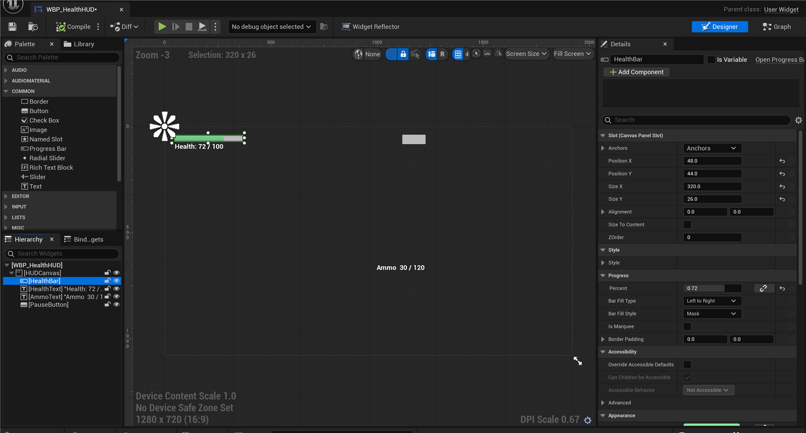
Figure: The UMG Designer · the Palette and widget Hierarchy (left), the visual Canvas with a health HUD (center), and the Details panel for the selected widget (right).
Working with Anchors
Anchors determine how a widget positions itself relative to its parent, especially when the screen resizes. They're crucial for responsive UI.
Anchors are shown as a flower-like icon in the canvas. Each petal represents an anchor point:
- Top-Left: Widget stays fixed distance from top-left corner
- Top-Center: Widget stays centered horizontally, fixed from top
- Center: Widget stays centered both horizontally and vertically
- Stretch: Widget stretches to fill the parent
Figure: Anchor presets determine how widgets respond to screen size changes.
Designer Keyboard Shortcuts
Speed up your workflow with these shortcuts:
- Ctrl+C / Ctrl+V: Copy and paste widgets
- Delete: Remove selected widget
- Ctrl+D: Duplicate widget
- Arrow Keys: Nudge selected widget
- Ctrl+Arrow: Larger nudge
- F2: Rename selected widget
✅ Naming Convention
Name your widgets descriptively in the Hierarchy panel. Instead of "TextBlock_0", use "TitleText" or "HealthLabel". This makes your Blueprint graph much easier to work with later.
Displaying Widgets
Creating a Widget Blueprint is just the first step—you also need to display it on screen. UMG provides several ways to show widgets, each suited to different use cases.
Add to Viewport
The most common way to display a widget is adding it to the Viewport—the 2D layer that overlays the game view. Viewport widgets are screen-space, meaning they stay fixed on screen regardless of camera movement.
Basic Steps:
- Create an instance of the Widget Blueprint
- Add it to the viewport
- Optionally store a reference to manipulate it later
In Blueprint, this looks like:
Create Widgetnode — Select your Widget Blueprint class, specify owning playerAdd to Viewportnode — Displays the widget on screen- Store the return value in a variable for later access
Figure: Creating and displaying a widget in Blueprint.
Where to Create Widgets
The location of your widget creation code matters:
Player Controller: Best for HUD elements that persist throughout gameplay. The Player Controller exists as long as the player is in the game, making it ideal for health bars, ammo counters, and similar persistent UI.
Character/Pawn: Can work but be careful—if the character respawns, the widget might be duplicated or lost. Better to use Player Controller.
Level Blueprint: Good for level-specific UI like tutorials or cutscene elements that only appear in certain levels.
Game Mode: Good for game-wide UI managers, though Game Mode only exists on the server in multiplayer.
Widget itself: Widgets can create other widgets. A main menu might create a settings submenu when a button is clicked.
Z-Order (Layer Order)
When multiple widgets are on screen, Z-Order determines which appears on top. Higher Z-Order values render on top of lower ones.
The Add to Viewport node has an optional Z-Order input. Common conventions:
- 0-10: Background UI, world markers
- 10-50: Normal HUD elements
- 50-100: Menus, overlays
- 100+: Popups, tooltips, critical alerts
Removing Widgets
To hide or remove a widget:
Remove from Parent: Completely removes the widget from the viewport. The widget instance still exists if you have a reference, but it's not visible. Call Add to Viewport again to show it.
Set Visibility: Hides the widget without removing it. Options include Visible, Hidden (invisible but takes up space), Collapsed (invisible and takes no space), and Hit Test Invisible (visible but doesn't receive input).
Figure: Different visibility states affect rendering and input differently.
Widget Components (3D World UI)
Sometimes you want UI attached to objects in the 3D world—health bars above enemies, name tags over players, or interaction prompts near objects. Widget Components make this possible.
A Widget Component is an Actor Component that renders a Widget Blueprint in 3D space. To use one:
- Add a Widget component to your Actor
- In Details, set the Widget Class to your Widget Blueprint
- Configure Draw Size (world units)
- Set Space to World (3D positioned) or Screen (always faces camera)
World Space: The widget exists in 3D space. It can be occluded by objects, scales with distance, and has a fixed orientation unless you update it.
Screen Space: The widget always faces the camera (billboarding). Good for name tags and health bars that should always be readable.
Figure: World Space vs Screen Space widget components.
⚠️ Widget Component Performance
Widget Components are more expensive than viewport widgets. Each one requires a render target. For many in-world UI elements (like damage numbers or lots of enemy health bars), consider using a single viewport widget that calculates screen positions instead.
Input Mode
When showing menus, you often need to change how input is handled—should clicks go to the UI or the game?
Set Input Mode Game Only: Input goes to the game (movement, shooting). Mouse cursor hidden. Use for gameplay.
Set Input Mode UI Only: Input goes only to UI widgets. Mouse cursor shown. Use for full-screen menus.
Set Input Mode Game and UI: Input can go to both. Mouse cursor can be shown or hidden. Use for HUD elements that need clicks while playing.
These are called on the Player Controller:
// In Player Controller Blueprint
Set Input Mode UI Only
Set Show Mouse Cursor = True
✅ Input Mode Checklist
When opening a menu:
- Set Input Mode UI Only (or Game and UI)
- Set Show Mouse Cursor = True
- Optionally pause the game (Set Game Paused)
When closing a menu:
- Set Input Mode Game Only
- Set Show Mouse Cursor = False
- Unpause if paused
Hands-On: Create Your First Widget
Let's create a simple HUD widget that displays the player's health. This exercise covers widget creation, adding elements, and displaying the widget through the Player Controller.
🎯 Exercise Goal
Create a HUD widget showing: a health label, a health bar, and a health percentage. Display it when the game starts. This covers the complete widget workflow from creation to display.
Step 1: Create the Widget Blueprint
- In Content Browser, right-click → User Interface → Widget Blueprint
- Name it
WBP_PlayerHUD - Double-click to open the Widget Editor
Step 2: Set Up the Root Panel
- In the Palette panel, find Canvas Panel
- Drag it into the Hierarchy or onto the canvas
- This becomes your root widget—all other widgets go inside it
Step 3: Add a Health Bar Container
We'll use a Vertical Box to stack our health elements:
- From Palette, drag Vertical Box into the Canvas Panel
- With the Vertical Box selected, in the Details panel:
- Set Anchors to Top-Left (click the anchor preset in Slot section)
- Set Position X: 50
- Set Position Y: 50
- Set Size X: 200
- Set Size Y: 60
- Rename it to
HealthContainerin the Hierarchy (F2 or right-click → Rename)
Step 4: Add the Health Label
- Drag a Text widget into the HealthContainer (Vertical Box)
- In Details:
- Set Text: "HEALTH"
- Under Appearance, set Font Size: 16
- Set Color: White
- Rename to
HealthLabel
Step 5: Add the Progress Bar
- Drag a Progress Bar into the HealthContainer (below the text)
- In Details:
- Set Percent: 0.75 (for preview—we'll bind this later)
- Under Appearance → Style → Fill Color and Opacity: Set to Red
- Under Slot → Size: Check "Fill" and set Fill to 1.0
- Rename to
HealthBar
Step 6: Add Health Percentage Text
- Drag another Text widget into the HealthContainer
- In Details:
- Set Text: "75%" (placeholder)
- Set Font Size: 14
- Set Justification: Right
- Rename to
HealthPercent
Figure: Widget hierarchy and preview of the health HUD.
Step 7: Compile and Save
- Click Compile in the toolbar
- Click Save
Step 8: Display from Player Controller
Now we need to display the widget. Open your Player Controller Blueprint (or create one if you don't have it):
- Open your Player Controller Blueprint
- In Event Graph, find or add Event BeginPlay
- Drag from the execution pin and add
Create Widget - In the Create Widget node:
- Set Class to
WBP_PlayerHUD - Set Owning Player to Self
- Set Class to
- From the Return Value pin, drag and add
Add to Viewport - Optionally, promote the Return Value to a variable named
HUDWidget
Step 9: Test
- Make sure your Game Mode uses your Player Controller (Project Settings → Maps & Modes, or set in World Settings)
- Press Play
- You should see your health HUD in the top-left corner!
✅ Exercise Complete!
You've created your first UMG widget and displayed it in-game! You've learned:
- Creating Widget Blueprints
- Using panels (Canvas Panel, Vertical Box) for layout
- Adding common widgets (Text, Progress Bar)
- Setting anchors for screen positioning
- Displaying widgets via Player Controller
In the next lesson, you'll learn how to bind the health bar to actual player data so it updates dynamically!
Troubleshooting
⚠️ Common Issues
Widget doesn't appear:
- Make sure your Player Controller is being used (check Game Mode)
- Verify the Create Widget class is set correctly
- Check that Add to Viewport is connected
Widget appears but is empty:
- You need a root panel (Canvas Panel) to hold other widgets
- Make sure widgets are children of the Canvas Panel, not siblings
Widget is in wrong position:
- Check anchor settings—Top-Left anchor keeps it in the corner
- Verify Position X/Y values in the Details panel
Can't see progress bar fill:
- Set Percent to a value greater than 0 (e.g., 0.75)
- Make sure Fill Color has visible alpha (not transparent)
Bonus Challenges
- Add Ammo Counter: Create a second Vertical Box in the top-right corner with ammo text
- Style the Health Bar: Add a border image behind the progress bar for a nicer look
- Add Player Name: Display a player name text at the top center of the screen
- Multiple Anchors: Try anchoring different elements to different screen corners
Summary
In this lesson, you've been introduced to Unreal Motion Graphics (UMG)—Unreal Engine's powerful system for creating user interfaces. From understanding what UMG can create to building and displaying your first widget, you now have the foundation for all game UI development.
Key Concepts
UMG Overview: UMG creates all types of game UI—HUD elements, menus, in-world UI, and notifications. It's built on the Slate framework but provides a designer-friendly, Blueprint-compatible interface.
Widget Blueprints: The fundamental building blocks of UMG. Each Widget Blueprint has a Designer view for visual layout and a Graph view for logic. Widgets combine panels (layout containers) with common widgets (buttons, text, images).
Widget Types: Panels like Canvas Panel, Vertical Box, and Horizontal Box organize layout. Common widgets like Text, Button, Image, and Progress Bar provide content. Widgets form parent-child hierarchies.
The UMG Designer: Visual editor with Palette (widget types), Hierarchy (widget tree), Canvas (preview), and Details (properties). Anchors control how widgets respond to different screen sizes.
Displaying Widgets: Use Create Widget to instantiate, Add to Viewport to display. Player Controller is the best location for persistent HUD. Z-Order controls layering. Visibility states control showing/hiding.
Widget Components: For in-world UI attached to actors. World Space widgets exist in 3D; Screen Space widgets always face the camera. More expensive than viewport widgets.
Input Mode: Controls whether input goes to game, UI, or both. Set appropriately when opening/closing menus.
UMG Quick Reference
| Task | Method | Location |
|---|---|---|
| Create UI layout | Widget Blueprint Designer | Content Browser → Widget BP |
| Add UI logic | Widget Blueprint Graph | Graph tab in Widget Editor |
| Show HUD | Create Widget + Add to Viewport | Player Controller BeginPlay |
| Show menu | Create Widget + Add to Viewport + Set Input Mode UI | Player Controller or Widget |
| Hide widget | Remove from Parent or Set Visibility | Any Blueprint with reference |
| In-world UI | Widget Component on Actor | Actor Components panel |
Common Panel Widgets
| Panel | Use Case | Example |
|---|---|---|
| Canvas Panel | Free positioning with anchors | HUD root, complex layouts |
| Vertical Box | Stack items top to bottom | Menu options, stat lists |
| Horizontal Box | Stack items left to right | Toolbars, button rows |
| Grid Panel | Arrange in rows and columns | Inventory slots, keyboards |
| Overlay | Stack widgets on top of each other | Icons with badges, layered elements |
Best Practices
- Start with Canvas Panel: Use it as your root widget for maximum flexibility
- Name your widgets: Rename from defaults like "TextBlock_0" to meaningful names like "HealthLabel"
- Use anchors: Set appropriate anchors so UI scales and positions correctly on different screens
- Store widget references: Keep references to widgets you need to update or remove later
- Create widgets in Player Controller: For persistent HUD that survives level changes
- Manage input mode: Always set input mode appropriately when showing/hiding menus
- Use visibility over remove: For frequently toggled UI, Set Visibility is more efficient than removing and recreating
Figure: The complete UMG workflow from creation to display.
What's Next?
Now that you understand the basics of UMG and can create simple widgets, the next lesson dives deeper into Creating Widgets. You'll learn about more widget types, styling options, and how to create reusable widget components. We'll also cover binding—connecting your UI to game data so health bars actually reflect player health!
Knowledge Check
Question 1
What does UMG stand for?
Correct answer: B — UMG stands for Unreal Motion Graphics. It's Unreal Engine's built-in UI framework for creating all types of user interfaces, from HUD elements to full menus.
Question 2
What are the two main views in a Widget Blueprint?
Correct answer: B — Widget Blueprints have a Designer view for visual layout (arranging widgets, setting properties) and a Graph view for logic (responding to events, updating data). You switch between them using tabs.
Question 3
Which panel widget would you use to stack menu buttons vertically?
Correct answer: C — Vertical Box stacks child widgets from top to bottom, making it perfect for menu options, lists, and any vertically arranged content. Horizontal Box does the same but left to right.
Question 4
What do anchors control in UMG?
Correct answer: B — Anchors determine how a widget positions itself relative to its parent, especially when the screen size changes. A top-left anchor keeps the widget fixed distance from the top-left corner; a center anchor keeps it centered.
Question 5
What is the recommended location to create and display a persistent HUD widget?
Correct answer: C — The Player Controller is the best location for persistent HUD elements. It exists as long as the player is in the game and survives character respawns, making it ideal for health bars, ammo counters, and similar persistent UI.
Question 6
What should you do when opening a full-screen menu that requires mouse interaction?
Correct answer: B — When opening a menu, you should Set Input Mode UI Only (so clicks go to the UI, not the game) and Set Show Mouse Cursor to True. When closing the menu, reverse these settings to return to gameplay.
Question 7
What is the difference between "Hidden" and "Collapsed" visibility states?
Correct answer: B — Hidden makes the widget invisible but it still occupies space in the layout (other widgets position as if it's there). Collapsed makes the widget invisible AND removes it from the layout (other widgets fill in the space).