🎬 Post-Process Effects
Post-process effects are the final layer of visual polish applied after your scene is rendered. They simulate camera behavior, enhance mood, and transform technically correct images into emotionally compelling ones. From the subtle warmth of a sunset to the gritty desaturation of a horror game, post-processing defines how players experience your world. In this lesson, you'll master Unreal's powerful post-process system to create distinctive, cinematic visuals.
🎯 Learning Objectives
By the end of this lesson, you will be able to:
- Configure Post Process Volumes for global and local effects
- Control exposure and auto-exposure for proper brightness
- Apply color grading and LUTs for distinctive visual styles
- Add bloom, lens flares, and vignette for cinematic polish
- Configure Ambient Occlusion for enhanced depth
- Create a complete cinematic post-process look from scratch
Estimated Time: 50-60 minutes
Prerequisites: Lesson 4.1-4.4 (Lighting Fundamentals through Lumen)
In This Lesson
Post Process Volumes Explained
Post Process Volumes are actors that define regions where specific post-processing effects apply. They're the containers that hold all your visual adjustments—from exposure to color grading to bloom. Understanding how they work is essential before diving into individual effects.
What Are Post-Process Effects?
Post-processing happens after the main scene rendering is complete. The engine has already calculated lighting, shadows, and materials—producing a "raw" image. Post-process effects then modify this image before it reaches the screen:
- Exposure: Adjusts overall brightness, simulating camera iris
- Color Grading: Shifts colors for mood and style
- Bloom: Adds glow around bright areas
- Lens Effects: Simulates camera lens behavior (flares, dirt, chromatic aberration)
- Depth Effects: Ambient occlusion, depth of field, motion blur
- Tone Mapping: Converts HDR to displayable range
Figure: Post-processing modifies the rendered scene before final display.
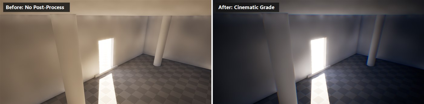
Figure: The same scene, captured live in UE 5.8, with no post-processing (left) and a complete cinematic post-process look (right) · color grading, bloom, vignette, ambient occlusion, and a lowered exposure, all applied through a single unbound Post Process Volume.
Placing a Post Process Volume
To add post-process effects to your level:
- Go to Place Actors panel (or press Ctrl+Shift+1)
- Search for "Post Process Volume"
- Drag it into your level
- Select the volume and open the Details panel
By default, the volume only affects the area inside its bounds (the visible box). For most projects, you'll want global effects.
Global vs. Local Volumes
Global (Infinite Extent): Check the Infinite Extent (Unbound) option in the Details panel. The volume now affects the entire level regardless of its position or size. This is your primary tool for establishing the overall look of your game.
Local (Bounded): Leave Infinite Extent unchecked. The volume only affects cameras inside its bounds. Use for specific areas: a dark cave, an underwater region, or a stylized dream sequence. You can scale and position the volume to match the area.
Figure: Global volumes affect the entire level; local volumes only affect their bounded region.
Volume Priority and Blending
When multiple Post Process Volumes overlap, Unreal blends their settings:
Priority: Each volume has a Priority value (Details → Post Process Volume Settings). Higher priority volumes take precedence. A Priority 1 volume overrides Priority 0 where they overlap.
Blend Weight: Controls how strongly this volume's settings apply (0.0 to 1.0). At 0.5, settings are blended 50% with other volumes.
Blend Radius: Creates a soft transition at the volume's edges. As the camera enters the blend radius, effects gradually fade in rather than popping abruptly.
✅ Common Setup
Most projects use one global Post Process Volume (Infinite Extent, Priority 0) for the base look, then add local volumes with higher priority for special areas. The global volume establishes your default visual style; local volumes create variations.
Understanding the Details Panel
The Post Process Volume's Details panel contains dozens of settings organized into categories:
- Lens: Bloom, exposure, chromatic aberration, dirt mask, vignette
- Color Grading: Temperature, tint, contrast, saturation, color curves, LUT
- Film: Toe, shoulder, white balance adjustments
- Rendering Features: Ambient occlusion, motion blur, screen space reflections
- Lumen: Global illumination and reflection overrides
- Post Process Materials: Custom material effects
Each setting has an override checkbox. Only checked settings are applied—unchecked settings use defaults or are inherited from other volumes.
flowchart TB
    subgraph Stack["Post Process Volume Stack"]
        direction TB
        A["Global Volume
Priority 0
Base Look"] --> B["Local Volume
Priority 1
Cave Area"]
        B --> C["Local Volume
Priority 2
Underwater"]
    end

    D["Camera Position"] --> E{"Inside which
volumes?"}
    E -->|"Global only"| F["Apply Global settings"]
    E -->|"Global + Cave"| G["Blend Global + Cave
Cave overrides where set"]
    E -->|"All three"| H["Highest priority wins
Underwater settings apply"]

    style A fill:#4CAF50,color:#fff
    style B fill:#2196F3,color:#fff
    style C fill:#9C27B0,color:#fff
Figure: Multiple volumes stack based on priority; higher priority overrides lower.
Exposure and Auto-Exposure
Exposure controls the overall brightness of your scene, simulating how a camera adjusts to different light levels. Getting exposure right is fundamental—it affects how players perceive your lighting, colors, and mood.
How Exposure Works
Real cameras (and eyes) adjust to ambient light levels. In a bright outdoor scene, the iris closes to prevent overexposure. Moving into a dark interior, the iris opens to gather more light. Unreal simulates this with exposure settings.
Unreal uses EV100 (Exposure Value) as its exposure unit. Higher EV = darker image (less exposure). Lower EV = brighter image (more exposure). A sunny outdoor scene might need EV 14-15; a dark interior might need EV 6-8.
Figure: EV100 scale from dark environments to bright outdoor scenes.
Auto-Exposure (Eye Adaptation)
By default, Unreal uses auto-exposure—the engine automatically adjusts exposure based on what the camera sees. This simulates eye adaptation: walk from outdoors into a dark building, and the image gradually brightens as your "eyes" adjust.
Auto-exposure settings in Post Process Volume (Lens → Exposure):
Metering Mode: How the engine measures scene brightness:
- Auto Exposure Histogram: Analyzes the distribution of brightness values. Most accurate.
- Auto Exposure Basic: Uses average scene luminance. Simpler, faster.
- Manual: You set a fixed exposure—no automatic adjustment.
Min/Max Exposure (EV100): Limits how far auto-exposure can adjust. Prevents the scene from becoming too dark or too bright. For example: Min EV 6, Max EV 14 keeps the game visible in both dark interiors and bright exteriors.
Speed Up/Speed Down: How quickly exposure adjusts when brightness changes. Higher values = faster adaptation. Speed Up is when going brighter; Speed Down is when going darker.
Exposure Compensation: An offset added to the auto-calculated exposure. Use to make the overall image brighter or darker while keeping auto-adaptation active.
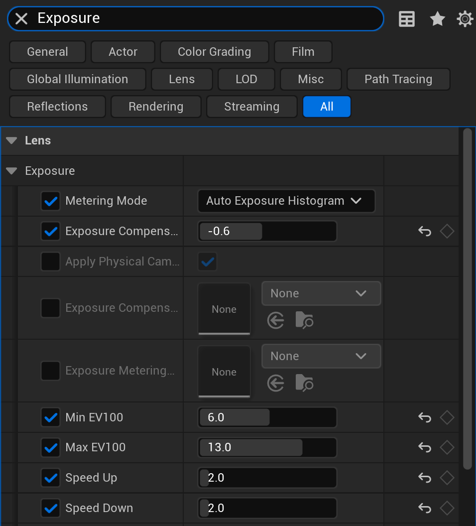
Figure: The real Lens · Exposure settings in a Post Process Volume (UE 5.8) · Metering Mode, Exposure Compensation, Min/Max EV100, and the Speed Up/Down adaptation controls. Only the ticked rows are overridden; unchecked rows stay greyed and inherit their defaults.
Figure: Auto-exposure analyzes scene brightness, calculates target EV, clamps to your range, and applies.
Manual Exposure
For complete control, switch to Manual metering mode and set a fixed exposure value. This is useful when:
- You want consistent brightness regardless of what's on screen
- Auto-exposure is causing unwanted flickering
- Specific artistic requirements demand precise control
- Cutscenes or cinematics where exposure is pre-planned
With Manual mode, set Exposure Compensation to adjust brightness. EV 0 uses the calculated "correct" exposure; negative values brighten, positive values darken.
Exposure Best Practices
✅ Exposure Tips
- Set appropriate Min/Max: Don't let auto-exposure make things unplayable. Set limits that keep gameplay visible.
- Consider gameplay: In a shooter, players need to see enemies. Don't let exposure hide threats in shadow.
- Match transitions to movement: Fast-paced games need faster adaptation (Speed Up/Down 2-3). Slow exploration games can use slower values (0.5-1).
- Test extremes: Look directly at the sun, then at shadows. Ensure both remain playable.
- Use Exposure Compensation: If auto-exposure is almost right but slightly off, adjust compensation rather than switching to manual.
Histogram Visualization
Enable the histogram view to understand your scene's brightness distribution:
- In the viewport, click the ▼ next to "Lit"
- Go to Exposure → Histogram
- A graph appears showing brightness distribution
- The red lines show your Min/Max EV limits
A well-exposed scene has the histogram filling the usable range without piling up at the extremes (clipping).
Color Grading and LUTs
Color grading is the art of adjusting colors to create a specific mood or visual style. It's what makes a horror game feel cold and desaturated, a tropical game feel warm and vibrant, or a noir thriller feel high-contrast with teal shadows. Unreal provides powerful color grading tools directly in Post Process Volumes.
Basic Color Adjustments
In the Post Process Volume, expand Color Grading → Global for fundamental adjustments:
Saturation: Controls color intensity. 1.0 is normal. Lower values desaturate toward grayscale. Higher values make colors more vivid. Most cinematic looks use slight desaturation (0.9-0.95).
Contrast: Difference between darks and lights. Higher contrast = punchier image with deeper shadows and brighter highlights. Lower contrast = flatter, softer look. Range around 0.9-1.2 for most uses.
Gamma: Adjusts midtones without affecting pure black or white. Higher gamma brightens midtones; lower darkens them. Useful for overall brightness fine-tuning.
Gain: Multiplies the entire image. Like exposure but applied after other color work. Useful for final brightness matching.
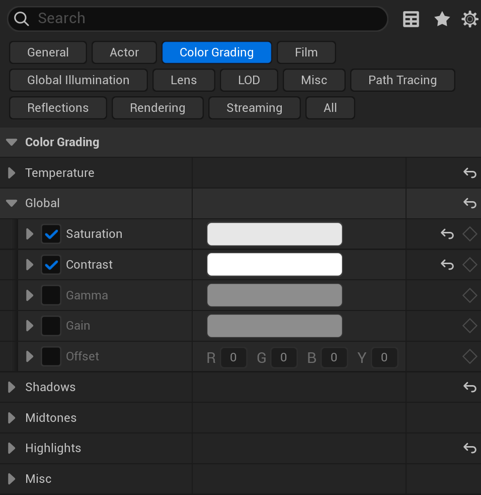
Figure: The real Color Grading category in a Post Process Volume (UE 5.8). The Global subsection is expanded with Saturation and Contrast overridden · each brightness range (Shadows, Midtones, Highlights) and White Balance (Temperature) has its own group below.
Figure: Saturation and contrast adjustments dramatically change the visual feel.
Temperature and Tint
Under Color Grading → White Balance:
Temperature: Shifts the image between warm (orange/yellow) and cool (blue). Measured in Kelvin-like values. Use warm for cozy interiors, sunset scenes; use cool for night, sci-fi, or tense moments.
Tint: Shifts between green and magenta. Usually kept near zero, but subtle tint can complement temperature adjustments or correct camera color casts.
Shadows, Midtones, Highlights
Color Grading offers separate controls for different brightness ranges:
Shadows: Affects the darkest parts of the image. Add blue to shadows for a cinematic "teal and orange" look. Add warmth to shadows for a vintage feel.
Midtones: Affects the middle brightness range—most of your visible detail. Subtle adjustments here have the biggest visual impact.
Highlights: Affects the brightest parts. Cool highlights with warm shadows creates pleasing color contrast. Warm highlights can feel like golden hour sunlight.
Each section has Saturation, Contrast, Gamma, Gain, and Offset controls that only affect that tonal range.
Figure: Shadows, Midtones, and Highlights let you grade different brightness ranges independently.
Look-Up Tables (LUTs)
A LUT (Look-Up Table) is a pre-made color transformation stored as a texture. Instead of manually adjusting dozens of color settings, you apply a single LUT that maps input colors to output colors. LUTs are industry-standard in film and TV for applying consistent color grades.
Using a LUT in Unreal:
- Create or obtain a LUT texture (16x16x16 or 32x32x32 color cube, usually exported as a 256x16 or 1024x32 strip image)
- Import the LUT texture into your project
- In Post Process Volume, expand Color Grading → Misc
- Set Color Grading LUT to your imported texture
- Adjust Color Grading LUT Intensity (0-1) to blend between original and graded
💡 Creating LUTs
LUTs can be created in software like DaVinci Resolve, Photoshop, or specialized LUT tools. The workflow: export a neutral LUT from Unreal, grade it in your preferred software, then import the graded LUT back. Many artists share free LUTs online for common looks (cinematic, vintage, horror, etc.).
The "Teal and Orange" Look
One of the most popular cinematic color grades pushes shadows toward teal/blue and highlights toward orange/warm. This creates visual separation between skin tones (warm) and backgrounds (cool). To achieve this in Unreal:
- In Color Grading → Shadows, add a slight blue/teal offset
- In Color Grading → Highlights, add a slight orange/warm offset
- Reduce global saturation slightly (0.9) for a more filmic feel
- Increase contrast slightly (1.05-1.1) for punch
Figure: The classic teal and orange grade creates color contrast between shadows and highlights.
Color Grading Best Practices
⚠️ Color Grading Guidelines
- Subtlety wins: Heavy color grading can look amateurish. Start subtle and increase gradually.
- Preserve readability: Players need to see gameplay-critical elements. Don't grade so heavily that enemies or items become invisible.
- Consistent with lighting: Color grading should complement your lighting, not fight it. Warm lighting + cool grading can look wrong.
- Test on target displays: Grading looks different on different monitors. Test on typical consumer displays, not just your calibrated monitor.
- HDR considerations: If supporting HDR displays, some color grading behaves differently. Test HDR output separately.
Bloom, Lens Flares, and Vignette
These effects simulate how real cameras and eyes respond to bright light. They add cinematic polish and help sell the illusion that players are viewing the world through a lens rather than a computer-generated window.
Bloom
Bloom creates a soft glow around bright areas of the image. In the real world, this happens when bright light scatters in the eye's lens or camera optics. In games, bloom makes lights feel more intense and adds atmospheric softness.
Bloom settings in Post Process Volume (Lens → Bloom):
Method: Choose between Standard (traditional) and Convolution (physically accurate but more expensive). Standard works well for most games.
Intensity: Overall bloom strength. 0 = no bloom. Values around 0.5-1.5 are typical. Too high creates a "vaseline on the lens" look.
Threshold: Brightness level where bloom begins. Only pixels brighter than this value bloom. Higher threshold = only the brightest spots glow. Lower threshold = more of the image glows.
Size Scale: How far bloom extends from bright sources. Larger values create bigger, softer glows. Smaller values keep bloom tighter around sources.
Figure: Bloom intensity controls how much bright areas glow into surrounding pixels.
Bloom Best Practices
✅ Bloom Tips
- Less is more: Subtle bloom (0.3-0.8) usually looks better than heavy bloom
- Adjust threshold: Raise threshold if too many things bloom; lower if only extreme brights should glow
- Match your style: Sci-fi often uses stronger bloom; realistic games use minimal bloom
- Consider emissive materials: Bloom makes emissive materials pop—coordinate material brightness with bloom settings
- Test different times of day: Bloom that looks good at noon might overpower at sunset
Lens Flares
Lens flares are artifacts caused by bright light scattering inside a camera lens. They create streaks, circles, and geometric patterns radiating from light sources. In games, lens flares add realism and cinematic drama—especially for outdoor scenes with a visible sun.
Lens flare settings (Lens → Lens Flares):
Intensity: Overall strength of lens flare effect. 0 = disabled. Higher values create more prominent flares.
Tint: Color applied to the lens flare. Can match your sun color or add stylistic variation.
Bokeh Size: Size of the bokeh (out-of-focus highlight) shapes in the flare. Larger = more prominent bokeh artifacts.
Threshold: Brightness required to trigger lens flares. Only very bright sources (sun, bright lights) should cause flares.
Figure: Lens flares create bokeh shapes and ghost artifacts spreading from bright sources.
Dirt Mask
The Dirt Mask simulates dust, fingerprints, or smudges on the camera lens. When bloom or lens flares occur, the dirt pattern becomes visible, adding gritty realism.
Settings (Lens → Dirt Mask):
Dirt Mask Texture: A texture defining the dirt pattern. Unreal includes default textures, or you can create custom ones.
Dirt Mask Intensity: How visible the dirt becomes when bloom/flares occur. Subtle values (0.5-2) add realism; higher values create obvious grunge.
⚠️ Lens Flare Caution
Lens flares became overused in games after they were popularized in early 2000s titles. Modern games often use them sparingly or not at all. Consider whether lens flares fit your visual style—they work well for cinematic sci-fi but may feel out of place in fantasy or horror.
Vignette
Vignette darkens the edges and corners of the image, drawing the player's attention toward the center. It's a subtle but effective technique for focusing attention and adding cinematic framing.
Settings (Lens → Image Effects → Vignette):
Vignette Intensity: How much the edges darken. 0 = no vignette. Values around 0.3-0.5 are typical. Above 0.7 becomes very noticeable.
Figure: Vignette darkens edges to focus attention on the center of the frame.
Chromatic Aberration
Chromatic aberration simulates the way cheap lenses fail to focus all colors at the same point, creating color fringing at the edges of the image. It adds a subtle imperfection that can make images feel more photographic.
Settings (Lens → Image Effects → Chromatic Aberration):
Intensity: Strength of the color separation. Very subtle values (0.1-0.5) add realism. Higher values create an obvious glitchy or damaged lens effect.
Start Offset: Where the effect begins (0 = center, 1 = edge). Setting to 0.5 keeps the center sharp while only affecting outer portions.
💡 When to Use Chromatic Aberration
Chromatic aberration works well for horror (damaged/old camera feel), action (chaos/intensity), or stylized games. For clean, realistic visuals, keep it very subtle (under 0.3) or disable entirely. Strong chromatic aberration can feel gimmicky.
Other Lens Effects
Additional lens-related settings worth knowing:
Grain: Adds film grain noise. Creates vintage or filmic looks. Use Grain Intensity (0.1-0.5 typical) and Grain Jitter for animation.
Depth of Field: Blurs objects not at the focus distance. Complex topic with Gaussian, Bokeh, and Circle DOF methods. Most commonly used in cinematics rather than gameplay.
Motion Blur: Blurs fast-moving objects/camera movement. Some players dislike motion blur, so consider making it optional. Settings include Amount and Max.
Ambient Occlusion
Ambient Occlusion (AO) darkens areas where surfaces meet, where objects sit on floors, and in crevices where ambient light would naturally be blocked. It adds depth, grounding, and subtle shadows that make scenes feel more three-dimensional and realistic.
What Ambient Occlusion Does
Without AO, objects can appear to float or lack connection to their environment. AO adds the subtle shadows you'd see in real life:
- Where a chair leg meets the floor
- In the corners of a room
- Where books sit on a shelf
- In the folds of fabric or character faces
These contact shadows are computationally expensive to calculate with regular lighting, so AO approximates them as a post-process effect.
Figure: Ambient Occlusion adds contact shadows that ground objects in the scene.
AO Methods in Unreal
Unreal offers several AO implementations:
Screen Space Ambient Occlusion (SSAO): Traditional post-process AO. Analyzes the depth buffer to find nearby surfaces and darkens accordingly. Fast but can have artifacts and only works for visible geometry.
Ground Truth Ambient Occlusion (GTAO): Improved screen-space method with better accuracy, especially in corners. Default in UE5. Good balance of quality and performance.
Ray Traced Ambient Occlusion (RTAO): Uses hardware ray tracing for accurate AO. Best quality but requires RTX/RDNA2+ GPU and has higher cost.
Distance Field Ambient Occlusion (DFAO): Uses mesh distance fields (same as Lumen Software RT) for large-scale AO. Good for outdoor scenes with big structures.
Figure: Different AO methods offer trade-offs between quality, performance, and compatibility.
Configuring Screen Space AO
In Post Process Volume (Rendering Features → Ambient Occlusion):
Intensity: Strength of the darkening effect. 0 = disabled. Values around 0.5-1.0 are typical. Above 1.0 creates very dark crevices.
Radius: How far the AO effect reaches. Larger radius = AO affects bigger areas (room corners, large surfaces). Smaller radius = AO only in tight crevices.
Power: Controls the falloff curve. Higher power = sharper, more defined AO. Lower power = softer, more spread out.
Quality: Number of samples used. Higher quality = less noise but more expensive. Use lower quality for fast-moving games where noise isn't visible.
Fade Out Distance/Radius: AO fades beyond this distance from camera. Saves performance on distant objects where AO isn't visible.
flowchart LR
    A["AO Goal"] --> B{"What's the issue?"}

    B -->|"AO too dark"| C["↓ Intensity
Try 0.3-0.5"]
    B -->|"AO too subtle"| D["↑ Intensity
Try 0.8-1.2"]
    B -->|"Missing big shadows"| E["↑ Radius
Try 100-200"]
    B -->|"Only want tight crevices"| F["↓ Radius
Try 20-50"]
    B -->|"AO looks noisy"| G["↑ Quality or
Enable temporal filter"]
    B -->|"Performance cost too high"| H["↓ Quality
↓ Fade Distance"]

    style C fill:#4CAF50,color:#fff
    style D fill:#4CAF50,color:#fff
    style E fill:#2196F3,color:#fff
    style F fill:#2196F3,color:#fff
    style G fill:#FF9800,color:#fff
    style H fill:#f44336,color:#fff
Figure: Common AO adjustments based on what you're trying to achieve.
Distance Field Ambient Occlusion
For large-scale AO (buildings casting shadows on ground, cliffs, large props), enable Distance Field Ambient Occlusion:
- Go to Project Settings → Rendering
- Enable Generate Mesh Distance Fields
- Restart the editor
- In Post Process Volume, find Distance Field Ambient Occlusion
- Enable and adjust Intensity, Occlusion Max Distance
DFAO works best combined with SSAO—DFAO handles large structures while SSAO handles small details.
AO Best Practices
✅ AO Tips
- Don't overdo it: Heavy AO makes everything look dirty. Aim for subtle depth enhancement.
- Consider art style: Stylized games may prefer less realistic AO. Realistic games benefit from accurate AO.
- Combine methods: SSAO/GTAO for details + DFAO for large scale often looks best.
- Watch for halos: If AO creates obvious halos around objects, reduce intensity or adjust radius.
- Performance scaling: Include AO quality in your scalability settings—lower settings can disable or reduce AO.
AO and Lumen Interaction
When using Lumen, you already get some ambient occlusion from the GI calculation. However, screen-space AO can still add value:
Small-scale detail: Lumen's radiance cache may miss very fine crevices. SSAO catches these.
Temporal stability: SSAO provides consistent small-scale darkening while Lumen's AO may shift slightly as the cache updates.
Performance trade-off: You can reduce SSAO intensity when Lumen is active since Lumen provides some occlusion naturally.
💡 Lumen + AO Recommendation
With Lumen enabled, try SSAO/GTAO at intensity 0.3-0.5 for additional fine detail. This supplements Lumen's natural occlusion without doubling up excessively. Test with AO on and off to see if the additional cost is worthwhile for your scenes.
Hands-On: Cinematic Post-Process Look
Let's bring everything together by creating a polished cinematic look from scratch. We'll build a stylized visual treatment that could work for an action-adventure game—warm tones, subtle bloom, grounded contact shadows, and careful exposure control.
🎯 Exercise Goal
Create a complete post-process setup with controlled exposure, cinematic color grading, subtle bloom, light vignette, and ambient occlusion. The result should feel polished and intentional—not over-processed.
Step 1: Set Up the Scene
Start with a scene that has interesting lighting to work with:
- Open an existing level or create one with varied lighting (indoor/outdoor mix ideal)
- Ensure you have a Directional Light, SkyLight, and some interior lights
- If using a template level, the Third Person map works well
- Remove any existing Post Process Volumes for a fresh start
Step 2: Create a Global Post Process Volume
- Go to Place Actors → search "Post Process Volume"
- Drag it into your level
- Select the volume and in Details panel, check Infinite Extent (Unbound)
- This volume will now affect the entire level
Figure: Configure the Post Process Volume for global effect before adjusting settings.
Step 3: Configure Exposure
Set up controlled auto-exposure:
- Expand Lens → Exposure
- Check the override box for Metering Mode, set to Auto Exposure Histogram
- Override Min EV100, set to 6.0 (prevents over-brightening in dark areas)
- Override Max EV100, set to 13.0 (prevents over-darkening outdoors)
- Override Exposure Compensation, set to 0.5 (slightly brighter overall)
- Override Speed Up and Speed Down, set both to 2.0 (moderate adaptation speed)
Test by looking at bright sky, then dark shadows. Exposure should adapt smoothly without extremes.
✅ Checkpoint: Exposure
Walk between bright and dark areas. The image should adapt within 1-2 seconds. Neither area should become unplayably dark or blindingly bright. If needed, adjust Min/Max EV to taste.
Step 4: Apply Color Grading
Create a warm, cinematic look with subtle teal shadows:
- Expand Color Grading → Global
- Override Saturation, set to (X=0.92, Y=0.92, Z=0.92, W=1) (slightly desaturated)
- Override Contrast, set to (X=1.08, Y=1.08, Z=1.08, W=1) (slightly punchy)
- Expand Color Grading → Shadows
- Override Shadows Gain, set to (X=0.95, Y=0.98, Z=1.05, W=1) (subtle teal/blue push)
- Expand Color Grading → Highlights
- Override Highlights Gain, set to (X=1.05, Y=1.02, Z=0.95, W=1) (subtle warm push)
- Expand Color Grading → White Balance
- Override Temp, set to 6200 (slightly warm)
Figure: Color grade values creating the classic teal shadows / warm highlights cinematic look.
Step 5: Add Subtle Bloom
- Expand Lens → Bloom
- Override Method, set to Standard
- Override Intensity, set to 0.5
- Override Threshold, set to 1.0 (only bright areas bloom)
The bloom should add subtle glow to lights and bright sky without creating a hazy look.
Step 6: Add Vignette
- Expand Lens → Image Effects
- Override Vignette Intensity, set to 0.35
This gently darkens the corners, focusing attention on center screen where gameplay happens.
Step 7: Configure Ambient Occlusion
- Expand Rendering Features → Ambient Occlusion
- Override Intensity, set to 0.6
- Override Radius, set to 60.0 (moderate reach)
- Override Power, set to 2.5 (defined but not harsh)
Check corners of rooms and where objects meet floors—you should see subtle darkening that grounds everything.
Step 8: Optional Finishing Touches
Consider these additional adjustments:
Chromatic Aberration (subtle):
- Override Chromatic Aberration Intensity, set to 0.15
- Override Chromatic Aberration Start Offset, set to 0.5
Film Grain (optional):
- Override Grain Intensity, set to 0.08
- Override Grain Jitter, set to 0.3
These add subtle imperfection that makes the image feel more photographic.
Figure: Complete settings summary for the cinematic post-process look.
Step 9: Test and Refine
Walk through your level and evaluate:
- Exposure: Are bright and dark areas both playable?
- Color: Does the teal/orange split feel natural, not overdone?
- Bloom: Do lights glow pleasantly without hazing the whole image?
- Vignette: Is it noticeable but not distracting?
- AO: Are objects grounded without dirty-looking halos?
Adjust values in small increments until you're satisfied. Remember: subtle is usually better than dramatic.
✅ Exercise Complete!
You've created a professional cinematic post-process look from scratch. These settings can serve as a starting point for your own projects. Experiment with different values to develop unique visual styles—darker and grittier, brighter and more colorful, or anything in between.
Bonus: Create Variation Volumes
Try creating local Post Process Volumes for different areas:
- Duplicate your global volume's settings to a new local volume
- Uncheck Infinite Extent and position it in a specific area
- Set Priority to 1 (higher than global)
- Adjust settings for that area (darker cave, warmer sunset view, etc.)
- Set Blend Radius to 100-200 for smooth transitions
This technique creates varied visual experiences as players move through your level.
Summary
In this lesson, you've mastered Unreal Engine 5's post-process system—the final layer of visual polish that transforms technically correct renders into emotionally compelling images. Post-processing is where good-looking games become great-looking games.
Key Concepts
Post Process Volumes: Containers that define where post-process effects apply. Use Infinite Extent for global settings; bounded volumes for local variations. Priority and Blend Weight control how multiple volumes interact.
Exposure: Controls overall brightness, simulating camera iris behavior. Auto-exposure adapts to scene brightness within Min/Max EV limits. Speed settings control adaptation time. Exposure Compensation provides overall brightness offset.
Color Grading: Adjusts colors for mood and style. Global settings affect entire image; Shadows/Midtones/Highlights provide tonal control. Temperature shifts warm/cool. LUTs apply pre-made color transformations. The teal-and-orange look creates classic cinematic color contrast.
Bloom: Adds glow around bright areas. Intensity controls strength; Threshold sets brightness cutoff. Subtle bloom (0.3-0.8) usually looks best. Works with emissive materials to make lights pop.
Lens Effects: Lens flares, dirt mask, vignette, and chromatic aberration simulate camera behavior. Use sparingly for cinematic feel without overdoing it. Vignette draws focus to center screen.
Ambient Occlusion: Darkens crevices and contact areas for depth and grounding. SSAO/GTAO for screen-space detail; DFAO for large scale; RTAO for maximum accuracy. Subtle AO (0.4-0.8) enhances realism without looking dirty.
Best Practices
- Subtlety wins: Heavy post-processing often looks amateurish. Start subtle, increase gradually
- Preserve gameplay: Never let visual style compromise player ability to see important elements
- Test extremes: Check bright areas, dark areas, fast motion, and different times of day
- Consider performance: Post-processing has GPU cost. Include quality options for lower-end hardware
- Stay consistent: Post-processing should complement your lighting and art direction, not fight them
- Use local volumes: Create visual variety by varying post-processing in different areas
Figure: The post-process toolkit transforms rendered scenes into polished final images.
Module Complete!
With this lesson, you've completed Module 4: Lighting Your World. You now understand the full lighting pipeline in Unreal Engine 5: from fundamental light types and outdoor sky systems, through interior lighting techniques and Lumen global illumination, to the final polish of post-processing effects.
In the next module, you'll begin learning Blueprints—Unreal's powerful visual scripting system. You'll discover how to make your beautifully lit worlds interactive, creating gameplay mechanics, responding to player input, and bringing your environments to life with logic and behavior.
Knowledge Check
Question 1
What does checking "Infinite Extent (Unbound)" on a Post Process Volume do?
Correct answer: B — Infinite Extent makes the Post Process Volume affect the entire level globally, regardless of where the volume is positioned or how large it is. This is the typical setup for establishing your game's base visual look.
Question 2
In auto-exposure, what do the Min EV100 and Max EV100 settings control?
Correct answer: B — Min and Max EV100 set the boundaries for auto-exposure. The engine won't adjust exposure beyond these limits, preventing the scene from becoming unplayably dark or blindingly bright in extreme lighting conditions.
Question 3
What is the effect of the classic "teal and orange" color grade?
Correct answer: B — The teal and orange look creates visual separation by pushing shadows toward cool teal/blue tones while warming highlights toward orange. This complements skin tones (warm) against backgrounds (cool) and is popular in cinematic color grading.
Question 4
What does the Bloom Threshold setting control?
Correct answer: C — Bloom Threshold sets the brightness cutoff for the bloom effect. Only pixels brighter than this value will bloom. Higher threshold means only the brightest areas glow; lower threshold makes more of the image bloom.
Question 5
What is the primary purpose of Ambient Occlusion in post-processing?
Correct answer: B — Ambient Occlusion darkens areas where surfaces meet, in corners, and in crevices—places where ambient light would naturally be blocked. This adds depth, grounding, and makes objects feel connected to their environment.